- Nov 2, 2021
- 2 min read
Updated: Nov 22, 2021
Email Broadcasting
It was my project at Netcore where I re-designed the Email Campaigning tool. I collaborated with Product Managers, Designers, Users and Developers to come up with a solution that improves the experience of the customers at Netcore.

The Task given
Revamp the E-mail campaigning tool

The product team at Netcore was working on the 'Retention' of the customer. Being a UX designer was approached by the Product Manager to re-design the workflow of the module. The team initially had a hypothesis of Revamping the entire product that withstands the updated design patterns and becomes a brand that caters to solve the problems for "Marketers' giving an experience that adds value to their strategy.
USP of the product :
1. Artificial intelligence to create strategy on the audiences in order to have better conversion rate
2. Templates for marketers to put least efforts in crafting the content.
What actually happened?
The role
UX Designer, giving end to end deliverable for the workflow and the UI of the web application.
I was a UX designer in the team Yogesh Kulkarni (Product Manager), Sagar Patil (Senior Product Manager), Johnson Minj (Senior UX Designer). The workflow design and final deliverable was my responsibility. The decision concerning the email content editor was supposed to come from the Senior Designer. Fortunately, I was able to work with the development manager as well as the users.
The duration
4 months
I was supposed to complete the task within a quarter so that the deliverable goes to the developing team. We went with 'DESIGN SPRINT' to come up with MVP in a short period.
The Challenges
Dealing with Stakeholder's bias
To validate stakeholder's hypothesis for priority of the feature in the application I interviewed users and also studied the persona, their projection with market share and the impact that will affect Netcore's customer.
Understanding the Mental model of the User
I realized mental model in B2B products is very much important. There was a design system available and it was created without consideration of the journey of email broadcasting. I experimented a usability testing for a couple of wire-frames to understand the user's approach and willingness to move into a different UI system


The Solution
Clickable Prototype on 'Sketch'
The above link has work made on Sketch and imported to Figma.
How did I solve?
The process
Research, Interviews

Spent 2 days for the observation and made the hypothesis of the problems which were observed.
Validated that observation through user interviews.
Persona Identification
The persona varies according to the marketer's role in his team. Identification of the persona helped me to project the impact on the customer-share.
- Marketer from startup
The marketer from a startups spends 3 days for a single campaign and uses most of the features.
- Marketer from MNC
The marketer from MNCs who uses the product is actually executives who broadcast 10-20 campaigns a days
- Marketer from marketing agencies
Agencies don't hold authority to execute any kind of campaigning without verifying from their client
Competitor's analysis
Mailchimp
MoEngage
WebEngage
OptiMonk
Clevertap
Empathize/ User journey Mapping

Spent some time with the marketers and the product and executed their task to empathize with them.
Created User Journey Mapping to prioritize the UI issues which were found after validations
Problem Identification
The prioritized problems were converted to design opportunities.
Problems observed:
- Aesthetic appeal of the product
- Time consumed to broadcast an email for the campaign
- User's irritation due to backtracking of a few parameters while strategizing for the campaign
- User's usage of multiple tools to execute the task
- Inclusion of the feature that increases user's learning curve for the task but gives better outcome
- Task relations and accessibility of the features with different cases were fractured
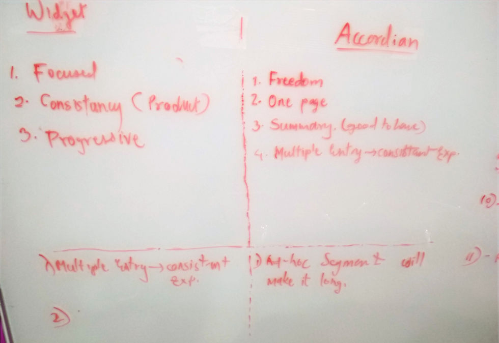
Concept Generation

The concepts were created and evaluated with the help of stakeholders

Evaluation with stakeholders
Worked on the task identification, relation between tasks their frequencies according to edge cases.

Information Architecture

Wire-framing
Clickable Wire-frame created to understand micro interactions
https://www.figma.com/file/PjU0bqgdmpAhmzFQLiFrub/New-Email-Flow-3
Final Design
The final design I had created is given here in the link:
https://www.figma.com/file/uMKRdDeSGjjypeDX4aLW4W/Email-Wireframe-5.1-2?node-id=0%3A4091
Usability testing
I did the testing with the in-house marketing team. While doing the user testing I also recorded the conversation for further evaluation with stakeholders.
Learning
The B2B business has a customer who expects particular functionality over the aesthetic appeal or a trending UI
Documentation of every progress or a milestone is very much important
Being proactive doesn't mean following up with the task but also find the problems which aren't found by other stakeholders and make an action for the same
No matter what type of stakeholder is they don't understand a wire-frame. It should be at least a low fidelity mock-up
What would I change now
I would try to bring the flexibility in the UI which was not given then.
Comments